Portfolio Images


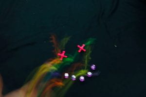
Image Transfer
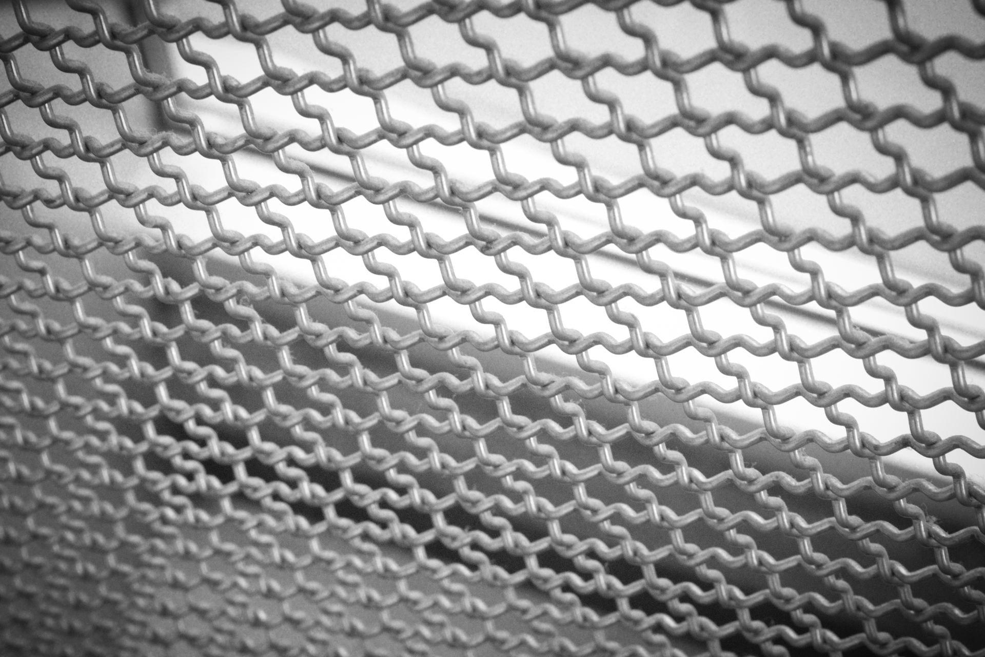
Black and White Shades of Gray
patterns
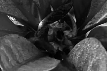
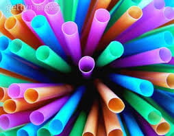
abstraction
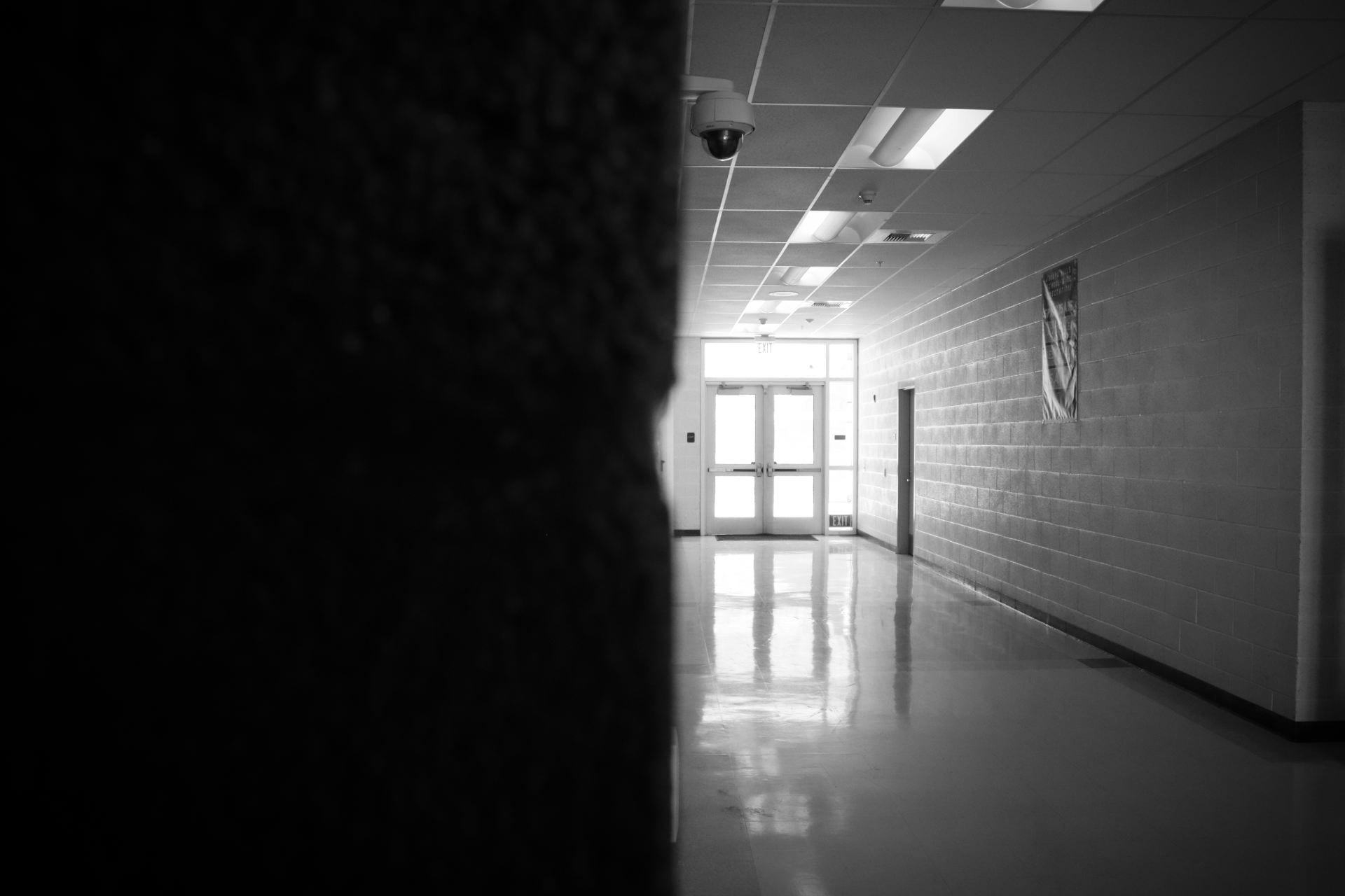
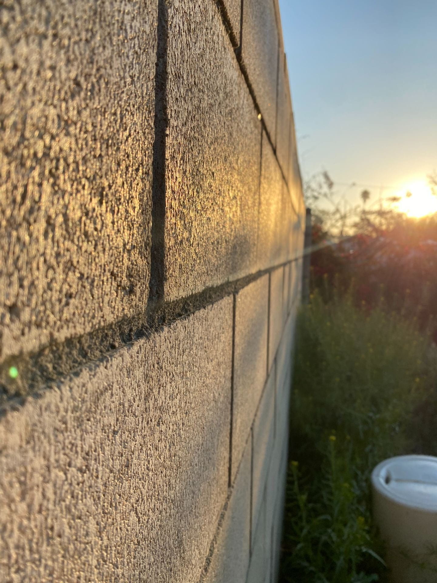
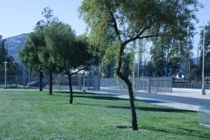
Rule of Thirds
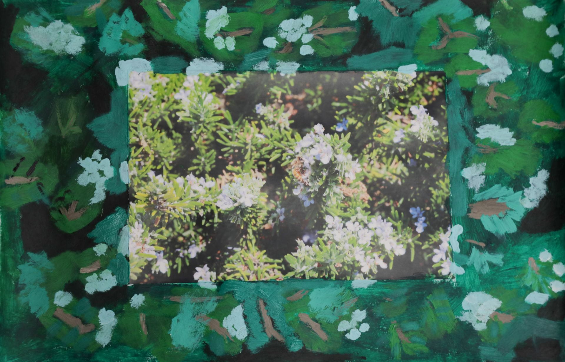
Digital Collage Based on a Theme
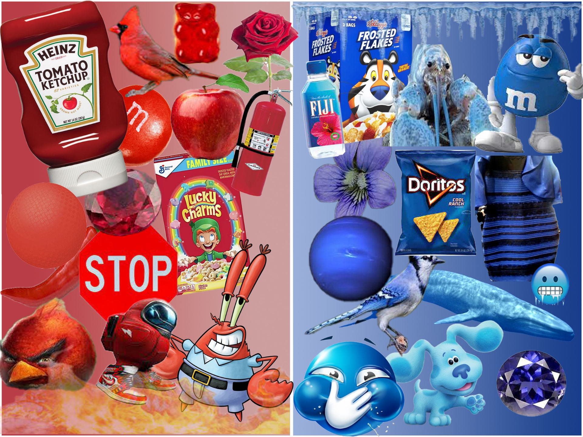
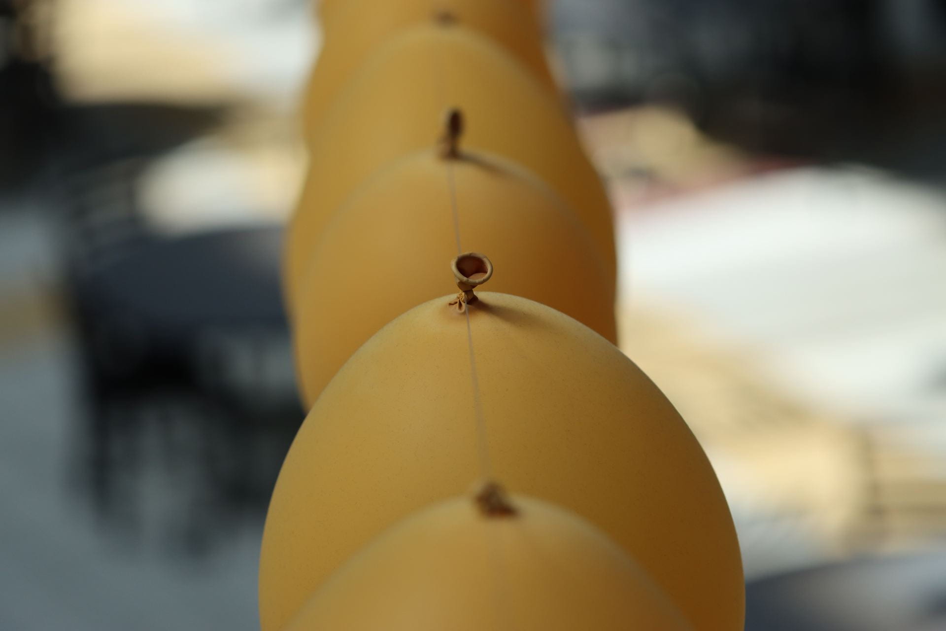
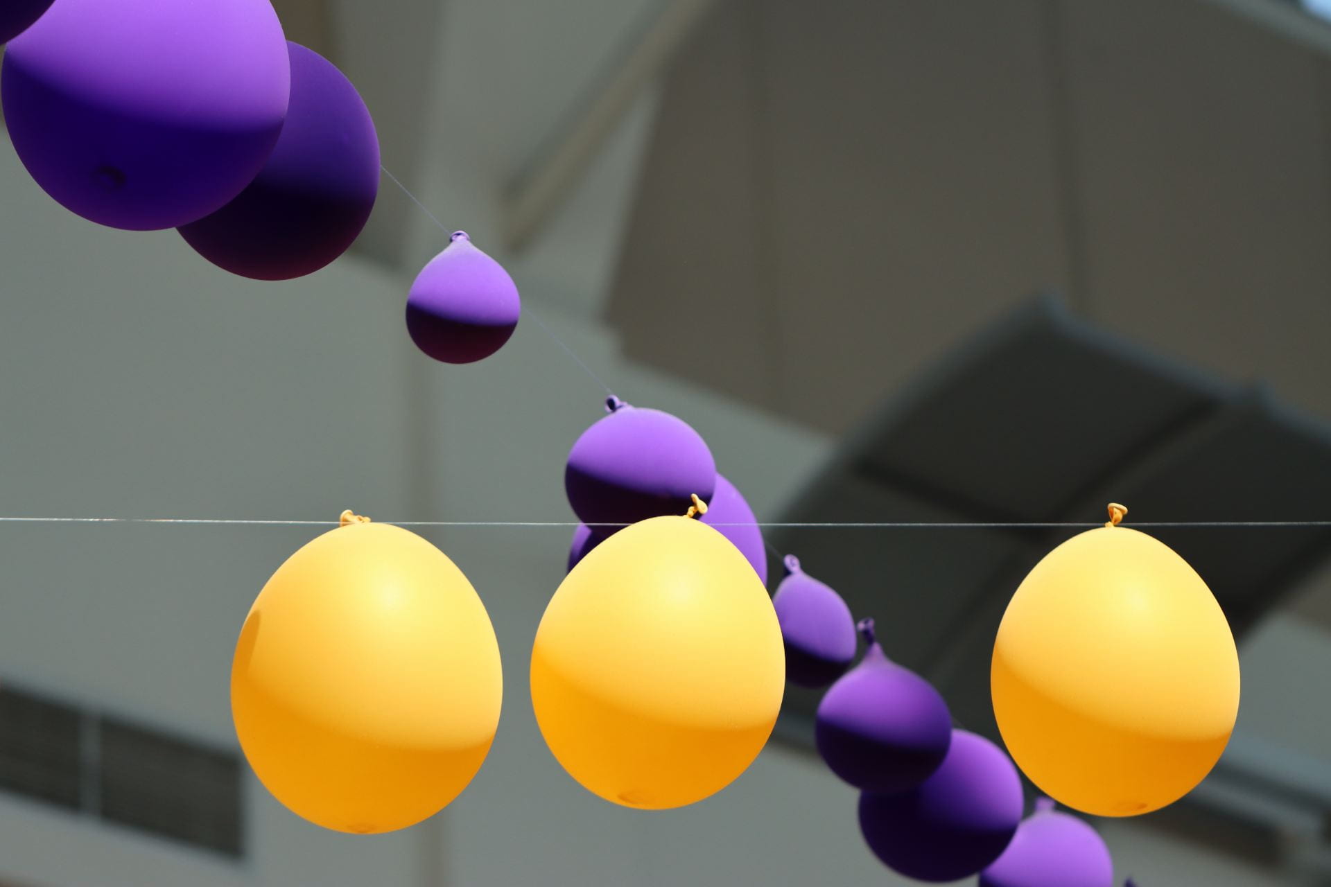
I conveyed my message in a silly simple way. There are two sides both have similarly good things and yet are still different. It may be up to the viewer to interpret the whole image and even the small things like the gradients and borders or the separation of the colors.
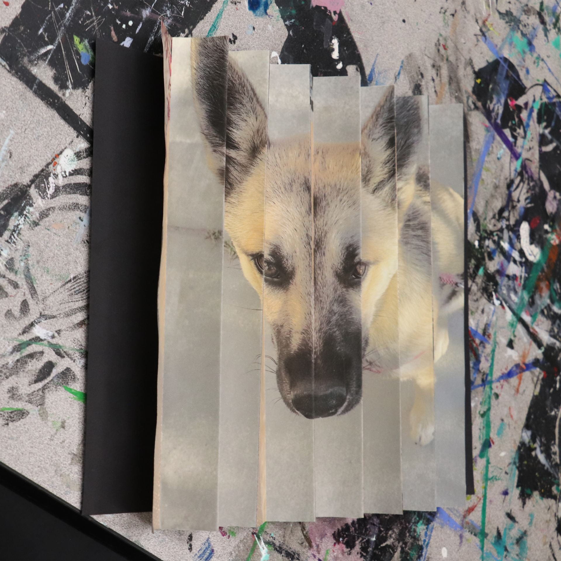
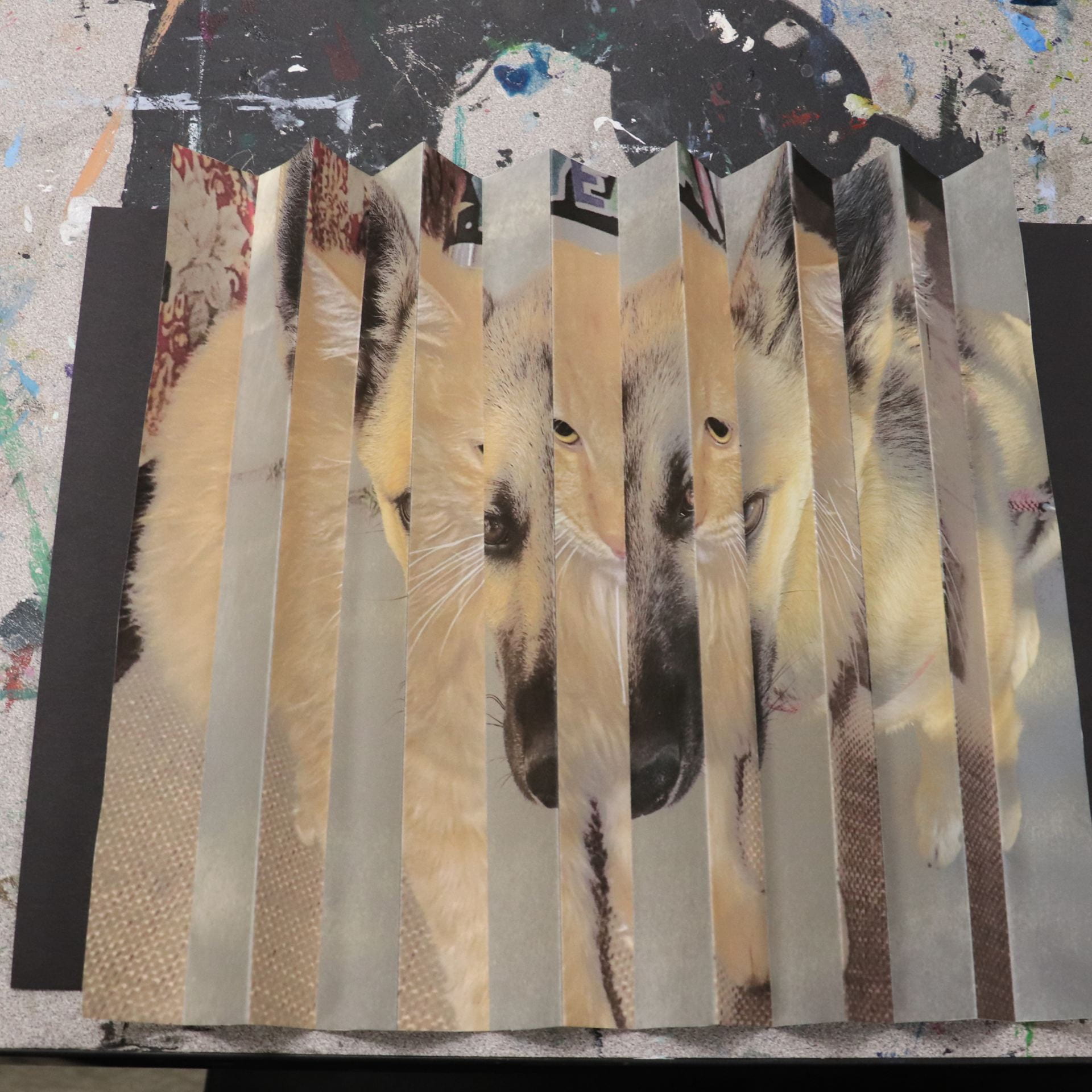
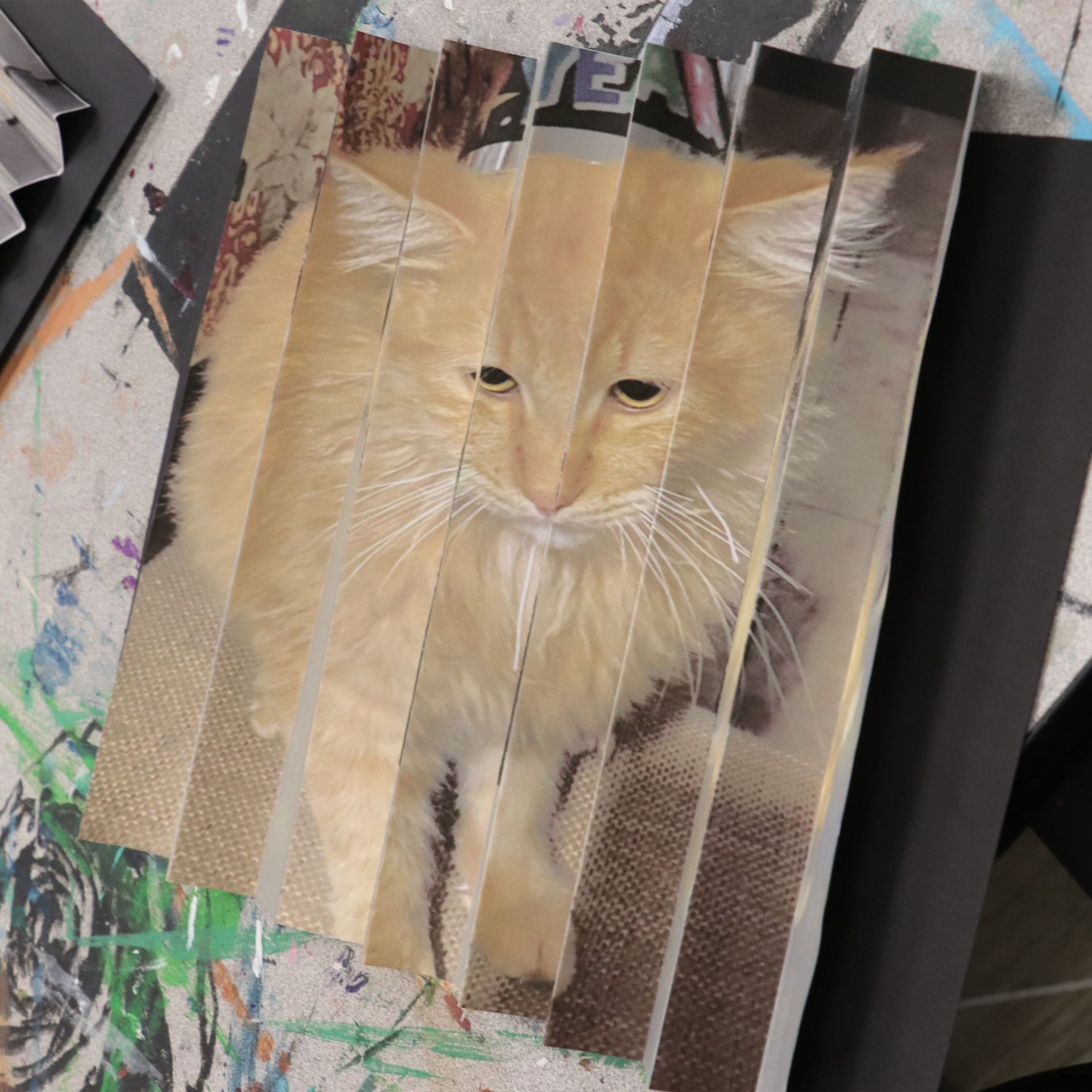
Kinoptic Art
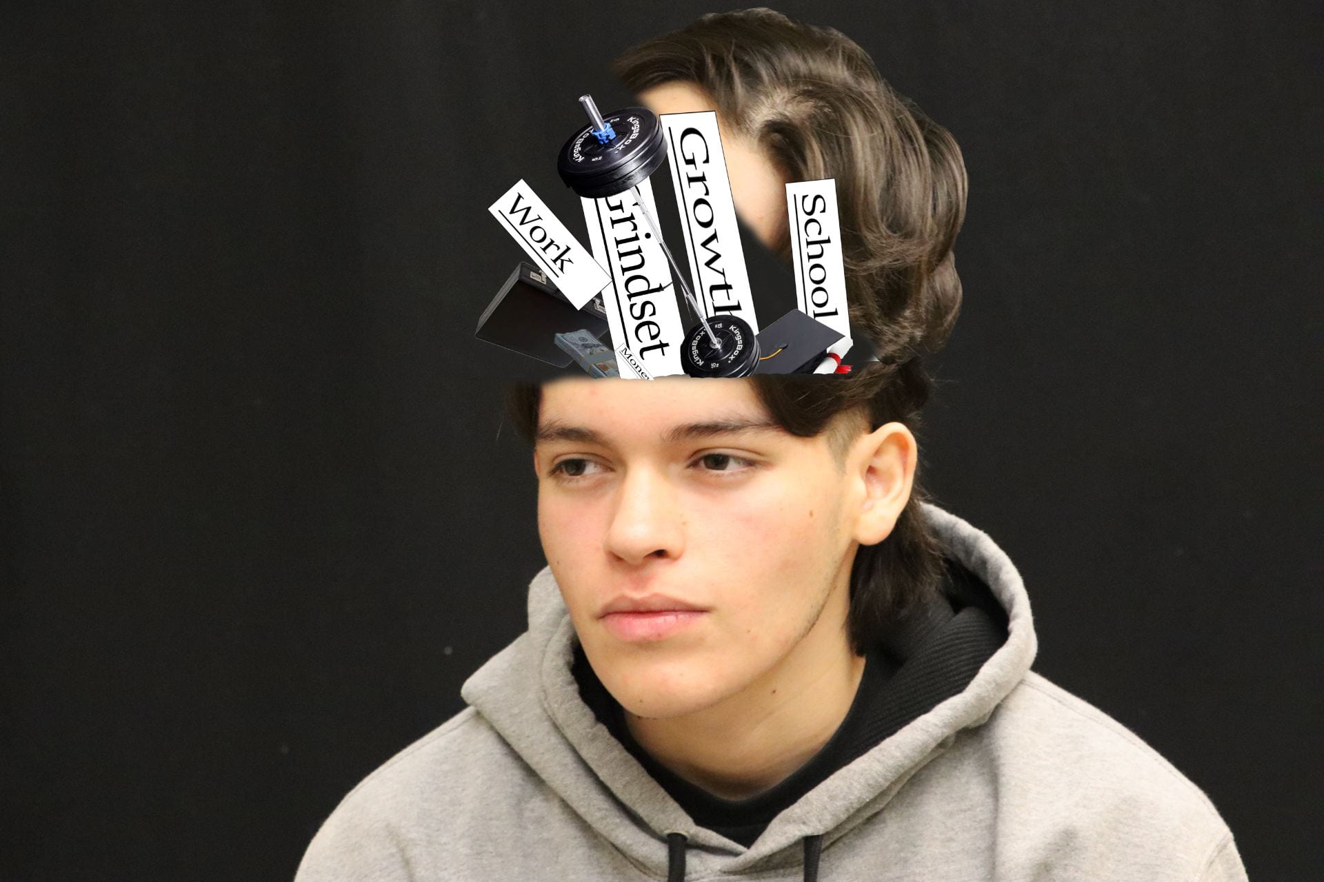
What’s In Your Head?
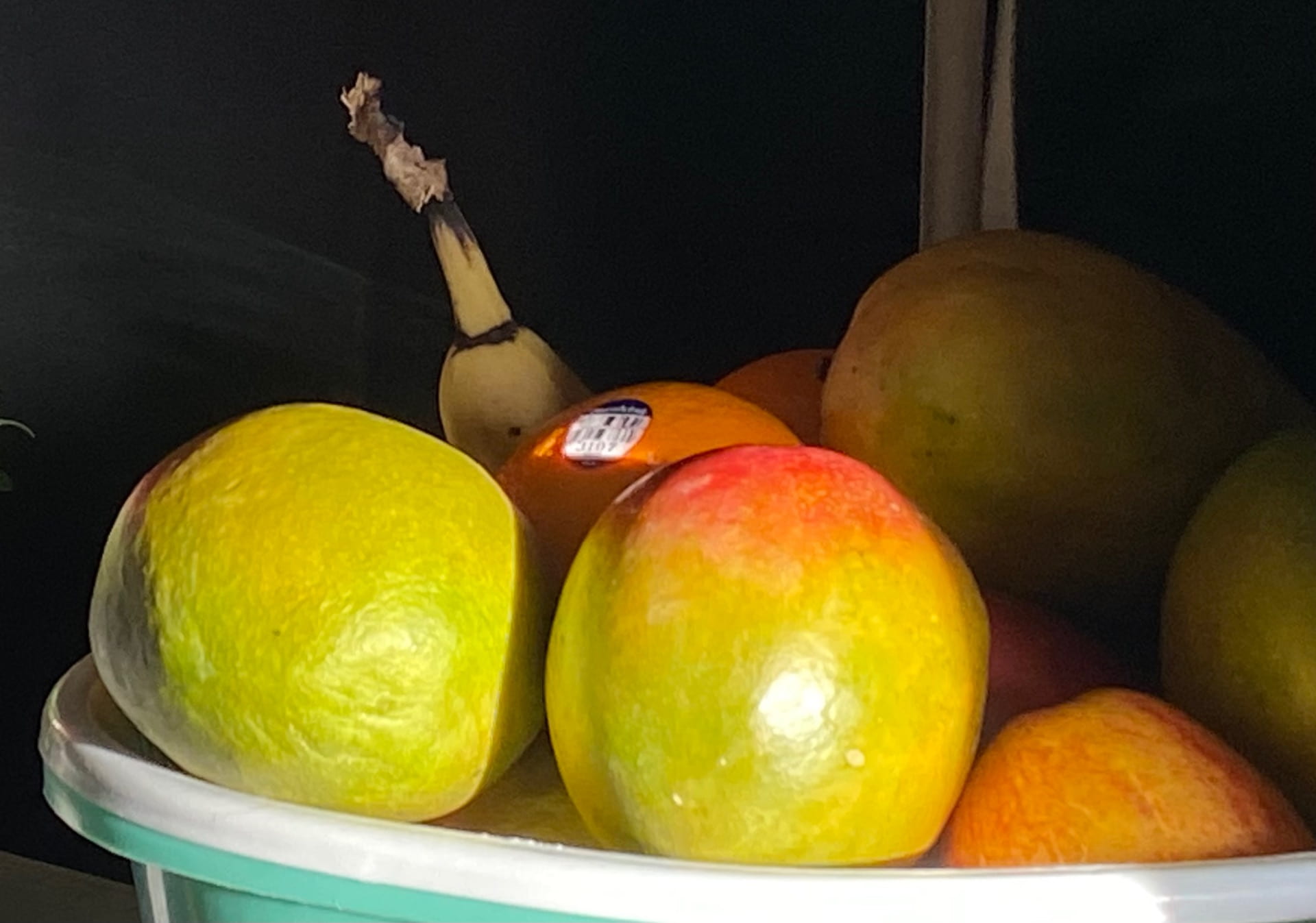
Food Photography
My Work

Research
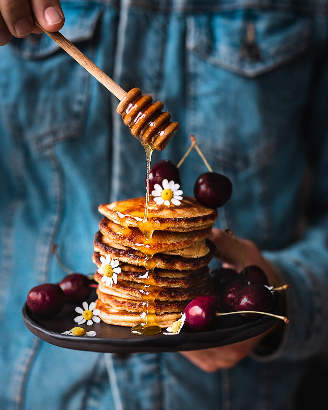
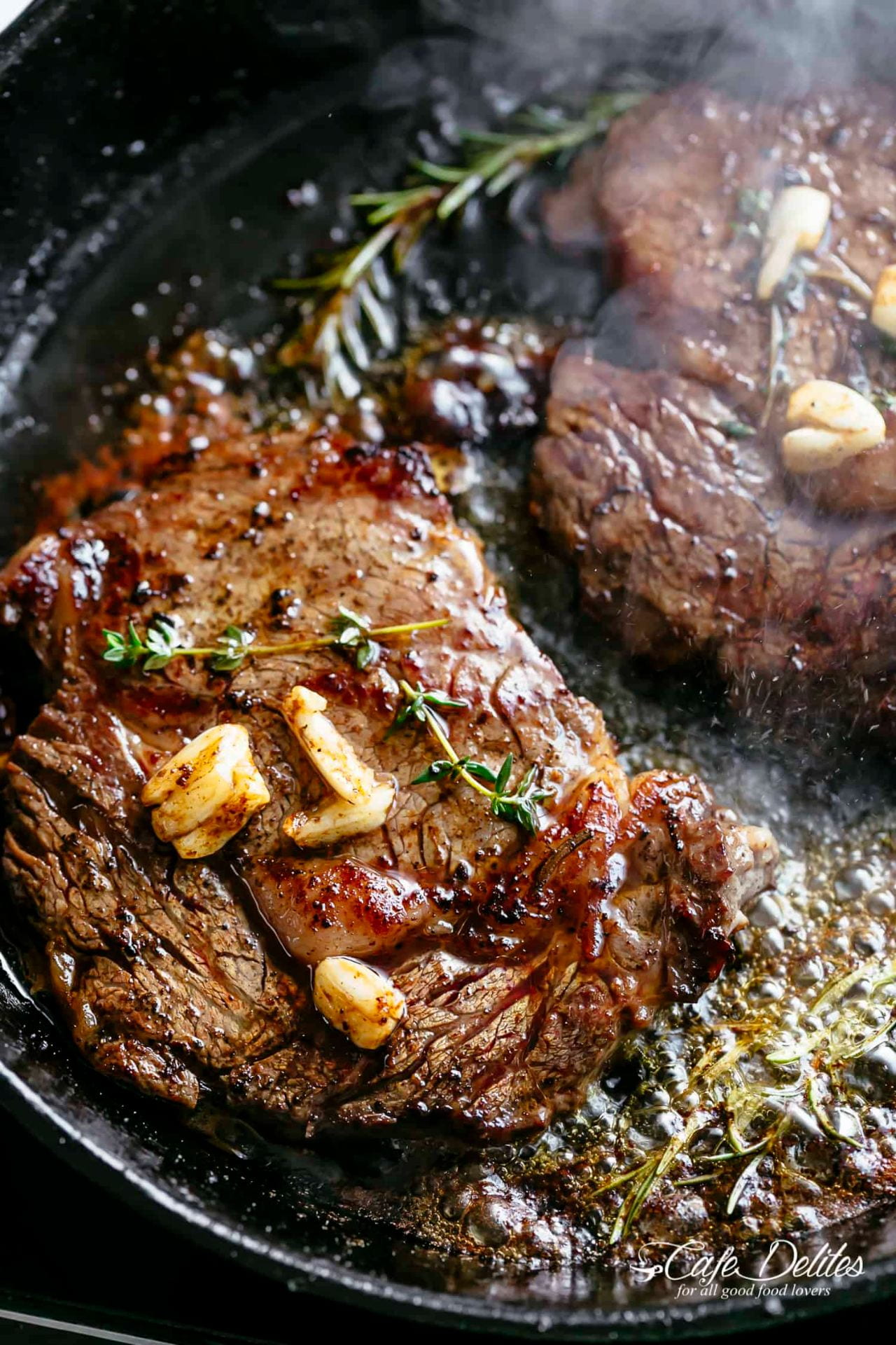
These two photos of food are a great representation of food photography. They both have good lighting to make it look better. I’m not even too into pancakes but that photo is making me want some. I love steak and that one in the photo looks very juicy and chewy. I can go on about the food, but this is about the photo composition. You can see that the pancakes are well centered with a side lighting that makes it look more detailed. The steak has a back lighting and really makes the juiciness pop out.
In the article there are five helpful tips on how to effectively photograph food. The first is work with a good team that makes the food look good when it is prepared on the plate and when its photo is being taken. Another tip is to make it look fresh and new by replacing the food or dishes if need be. The third is to emphasize the details on the food. Grill marks, melted shiny cheese, steam, and crispiness should be easily visible. If you can natural daylight would make the photo look better. If it’s not possible, try to make a similar lighting effect with strobes and hot lights. Finally, you wouldn’t want the viewer to be distracted by something in the background so using a shallow depth of field would better intensify the food. Experimenting with other photos may prove to be beneficial. However, techniques such as rule of thirds, and shallow depth of field are unrivaled with other compositional techniques. Understanding and using all of this would make amateur food photographs look professional.
Favorite Photographer Essay
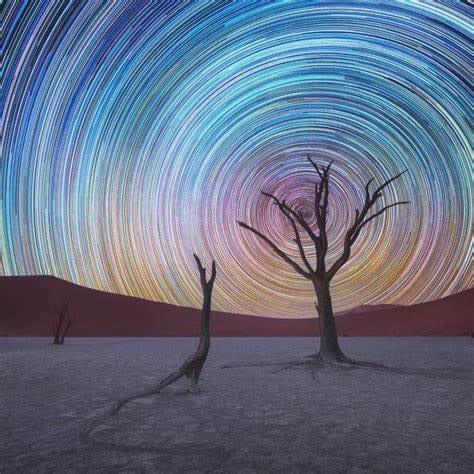
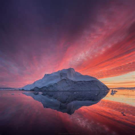
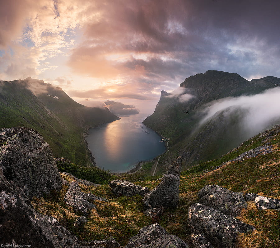
Looking at some of his photographs Daniel Kordan has to be my favorite photographer because of how he takes photos. The seclusion of the locations of his photographs is otherworldly and makes it seem like there are no people on Earth. His photos are presented in a way that looks as if it should be in a movie because of how majestic they are. Most of his photos have a minor surrealistic touch but he didn’t add them through photoshop. The way he implements surrealism is with the environment. You can see in one of the photos he used the backgrounds stars and set his shutter speed super slow to make a sort of ring effect from the stars. In another photo he used the reflection of the water to make the iceberg and the sky look like it was reflected. The water was somehow perfect enough to be reflected and the conditions for this must have been rare. In the final photo it looks like this was taken in Lord of the Rings. The way the mountains form a valley surrounding the water as well as the perfect sun lighting mixed the clouds is amazing. It makes you appreciate the world we have and how you’d want to preserve it for future generations.
LOGO FOR JURUPA HILLS PHOTOGRAPHY PROGRAM
![]()
Photo Essay
https://express.adobe.com/page/oImd9Jkh8Gi8F/
ctrl c and ctrl v on a new tab
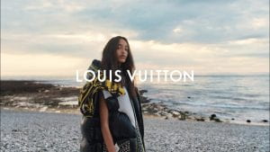
Fashion/Advertising Photography
Favorite Photographer Essay
Ansel Admas was born in San Fransico 1902 and died in 1984. He was known for mainly specializing in Landscape photography. Even though he had an old style he is still well known throughout the photography community because of his captures on the beauty of the Earth. Most of the photos Adams took were black and white.
Elements of Art
Inspiration
My work

David Hockney “Joiner”
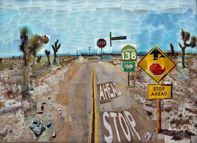
David Hockney’s work is one of my favorites because of how original it is. He decided to take different parts of an area and put them together like a puzzle. Doing this without photoshop meant he took a lot of time and put his heart into his work. This dedication makes it more meaningful, and he does it very well because he takes hundreds of pictures to complete one. He doesn’t change anything with the photo either and keeps the trash which could either be lazy or mean something else.
Photomontage

In ten years, I would like to live near home but not at home. One of the most noticeable things is the unreal engine logo in the sky. I would like to make a career making video games and Unreal engine is a game engine in which you can make video games. I added in the airplane to show that I would like to travel and hope to be traveling in 10 years.
Adding in a hellcat is unrealistic but I do hope to own one in the next 10 years. The guy on the bike doesn’t really explain that I see myself biking in the next ten years but that I will be doing healthier productive activities. The person in the cap and gown shows me being graduated.
The boat in the water shows me trying to do new fun things in the upcoming decade and maybe do them with other people I know or will know. You can notice that all the things I added into the picture are facing away from the Mcdonalds. In the next 10 years I will not be eating as much fast food and will be eating healthier homemade meals and dinners or fruits and vegetables.
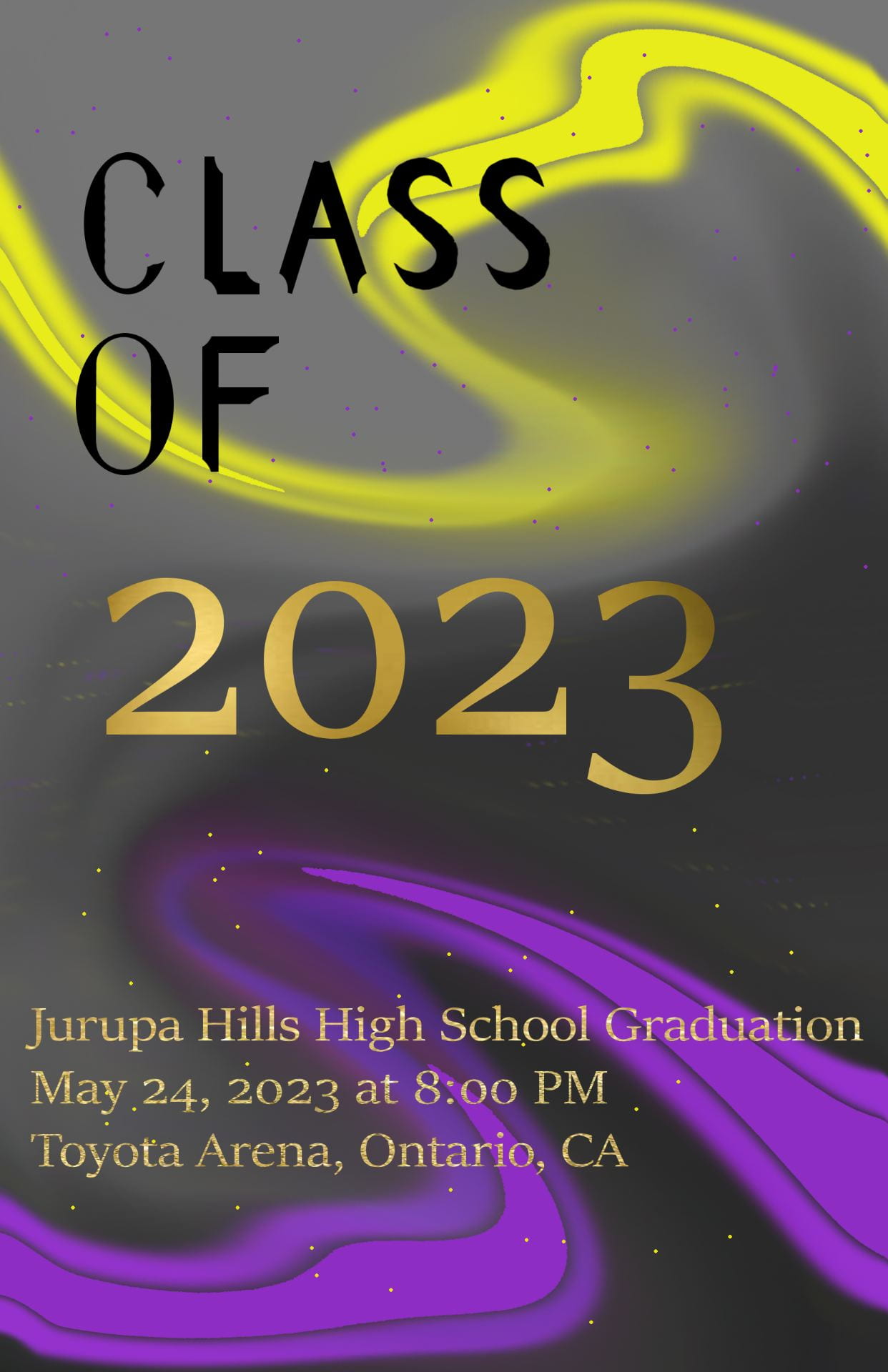
Graduation Cover Design
Valentine’s Day Card

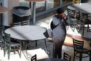
Motion Blur
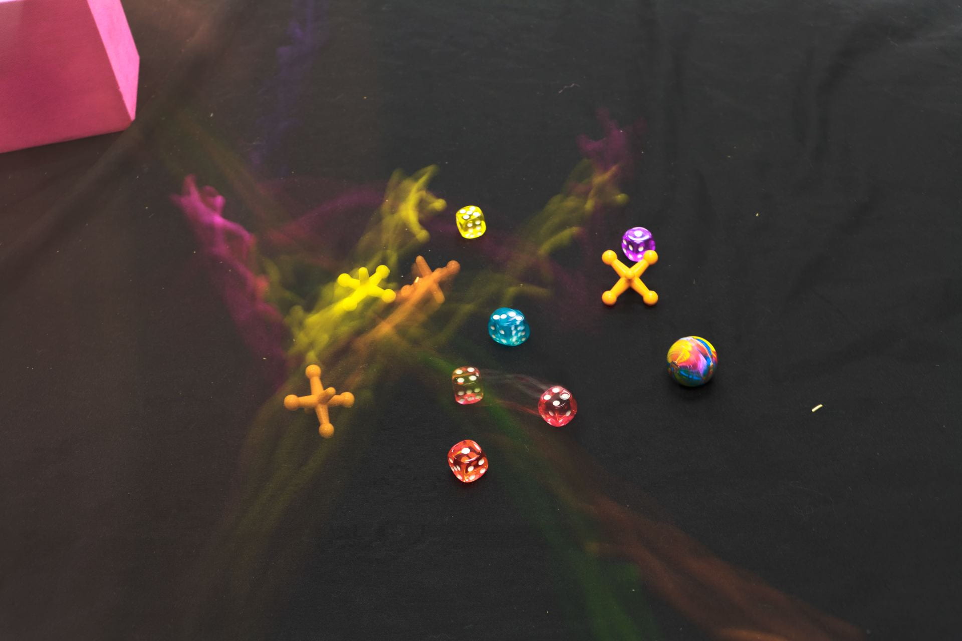
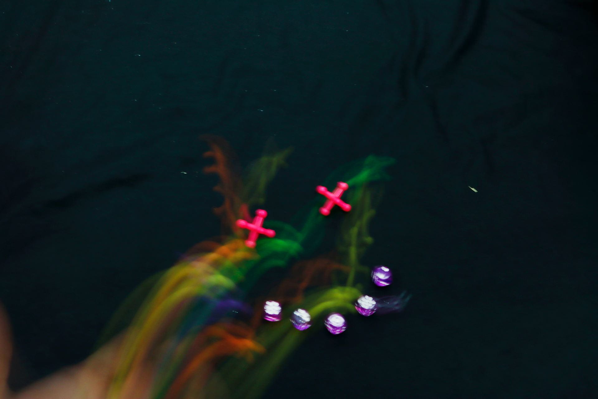
- Set up in a pattern beforehand for better composition.
- Do not toss it into the picture, drop it.
- The darker the iso, the more vibrant it will be.
- Top angles give better results but is harder to see.
- Dark backgrounds also bring out the vibrance.
Artist Statement
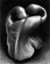
Body, Shape, Form
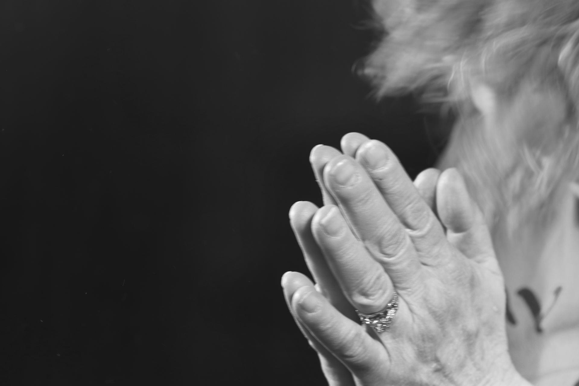
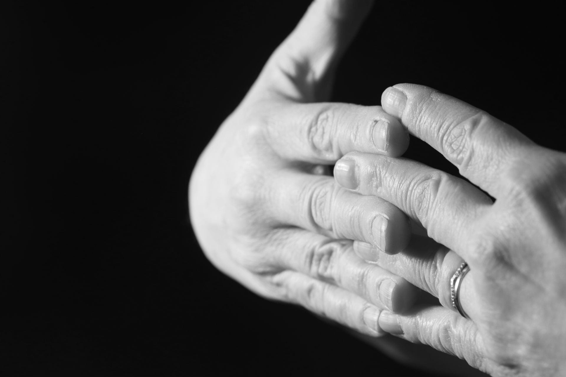
- I think it came out well, but I had to heavily edit them because they looked to bright.
- I think both are a success because they both show parts of the body in different shapes and forms.
- Is the lighting good? does it meet good composition standards? is it blurry?
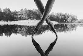
- The work makes me feel unified because of how the hands clasp each other.
Keith Haring Inspired work
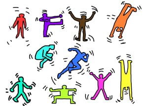
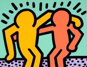
This is my favorite work by Keith Haring because it one of his more wholesome works. There isn’t a lot going on like his other drawings because there are only two characters. Keith used only four colors and they were somewhat diverse. What i think he was trying to communicate or tell the viewer was something about friendship and companionship. I think this because the figures are holding each other as if they were good chums or pals.
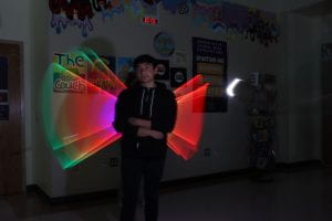
Light Painting Portraits
Mixed Media Screen-print Art

Screen-printing
Create a Work in the Style of Sandy Skoglund
Scavenger hunt
Nature/Landscape Photo with Painting Extension
10/10/22
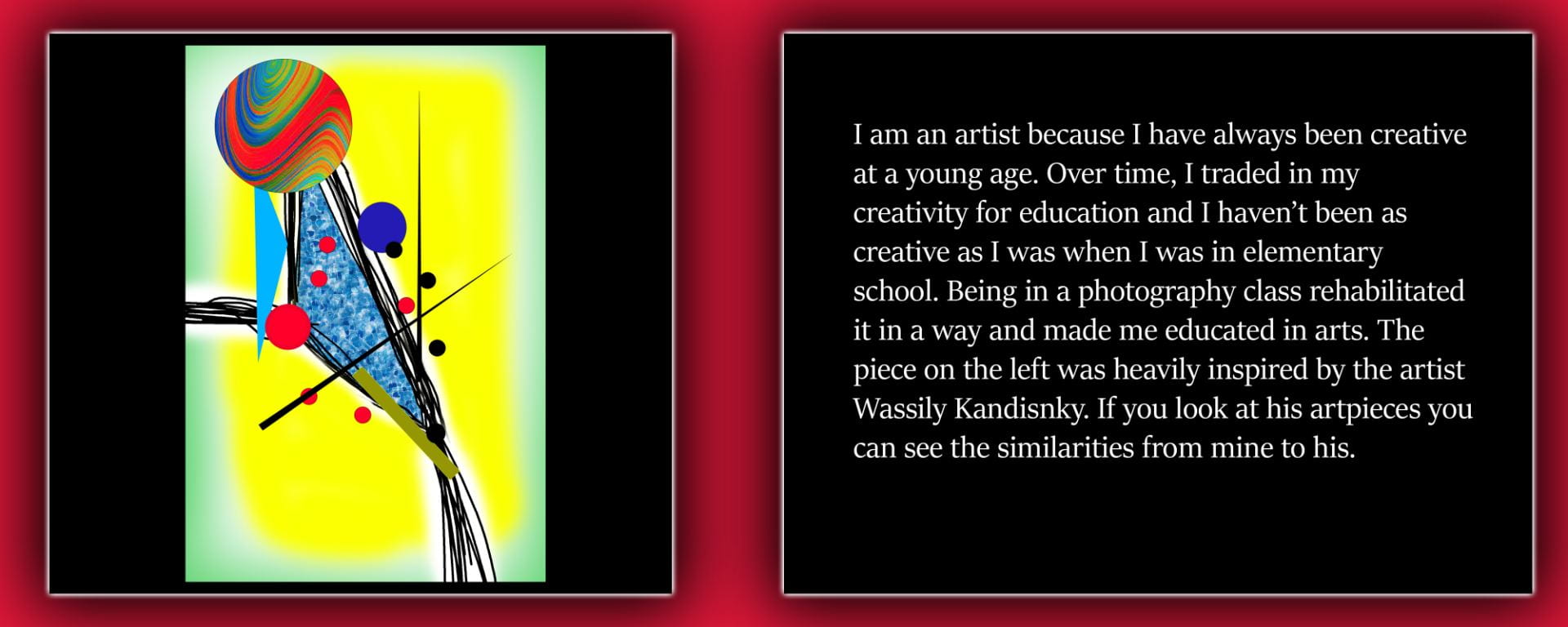
Create a Work in the Style of Wassily Kandinsky
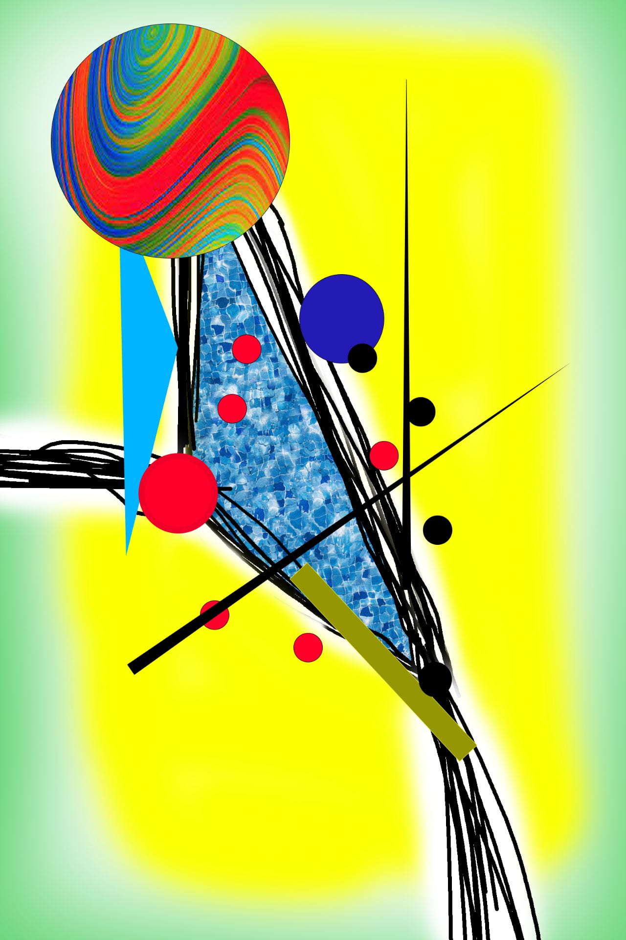
After researching Wassily Kandinsky I found out that he was born and lived around the times of 1866 and 1944. Looking at his art I find it very impressive how he overlapped the shapes and made them look as if there colors were mixing when they overlapped. This was decades before modern technology where computers could easily do this. Wassily did all this with painting tools. The paintings he makes are mostly abstract and were said to be made the way he heard music. He seems to use lots of shapes and lines so for mine I included lots of circles, lines and other shapes. I tried making the colors diverse because I noticed that Wassily did that in his paintings. I also put everything in a clump just like he as did to match his style as much as possible.
10/7/22
Social And Political Issues In Art
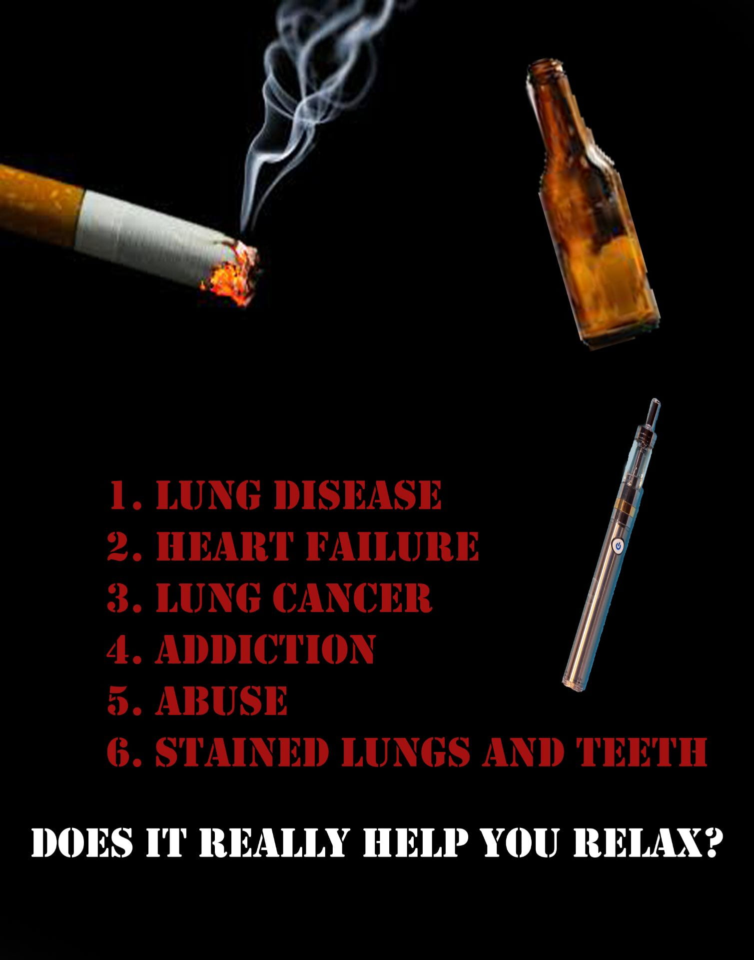
For this poster I am against substance and drug abuse. Pretty much everyone told me that drugs are bad for you ever since I was in elementary school. It is really bad to get into the habit of drinking or smoking because all of these drugs have addictive chemicals that can make it difficult to stop using drugs. Some may say that cigarettes and vapes can help you relax and calm down but that’s just not true. Cigarettes and vapes are the highest causes of lung cancer, lung disease, and can cause stained teeth. I think that drugs are bad because all they do is ruin the lives of the people that use them. This poster isn’t meant to offend, it is meant to inform the person who sees it about the dangers of certain drugs. It is really easy to see what is meant to be shown in the poster and it should be impossible not to see the message being presented. It is very simple an d gets the point across. There isn’t a center of interest because the entire picture is about one thing, bad outcomes of drug abuse.
9/26/22
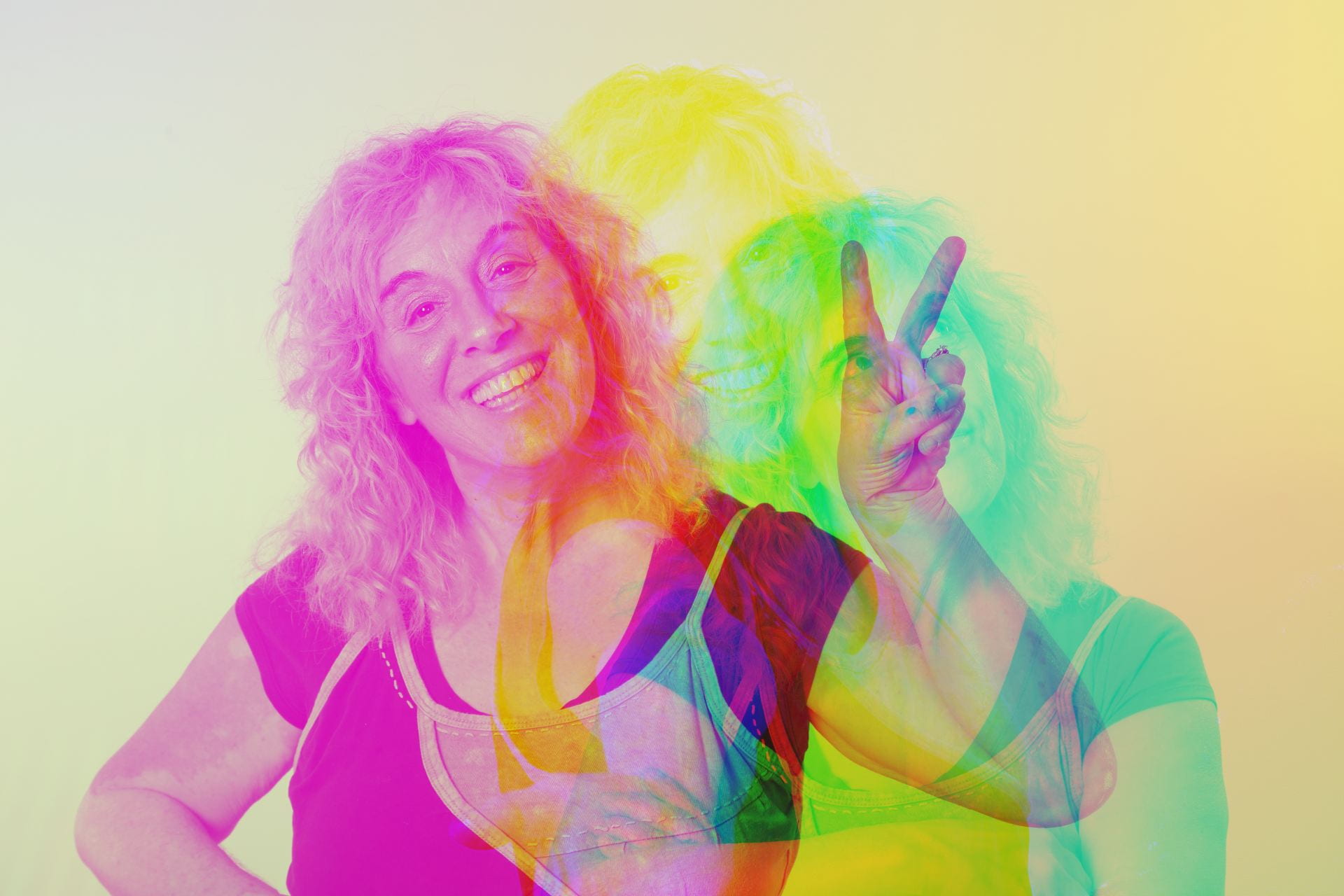
Double Color Exposure
9/16/22
Block Printing
9/16/22
Cut & Paste Collage
9/02/22
Triptych 8/26/22
8/26/22
Mirror Imagery 8/26/22
8/26/22
Man and Nature
8/26/22
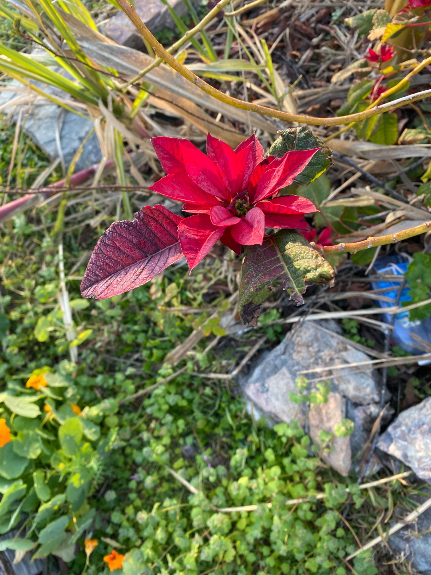
Shallow Depth of Field
8/26/22